转自:设计达人(ID:shejidaren888)
链接:http://www.shejidaren.com/music-app-ui-designs.html
今天我们整理一系列以音乐为主题的APP UI设计作品,在这些作品中,可以看出现在设计师们特别喜欢玩「模糊大投影」、「无分隔线设计」这些高级玩意,你有没有跟上大家的步伐呢?
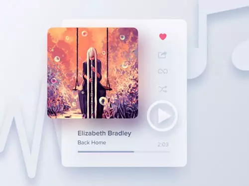
1. Mix Planet by Michael Korwin
https://dribbble.com/korwin
CD封面的阴影好像是使用「高斯模糊」的方法来实现的,看上去有很漂亮,但又感觉有点不真实,也许这是音乐界面,要的就是时尚感吧!

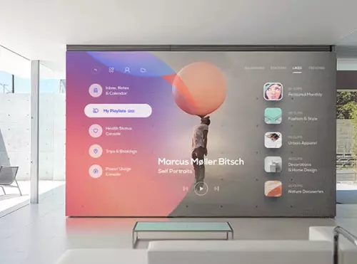
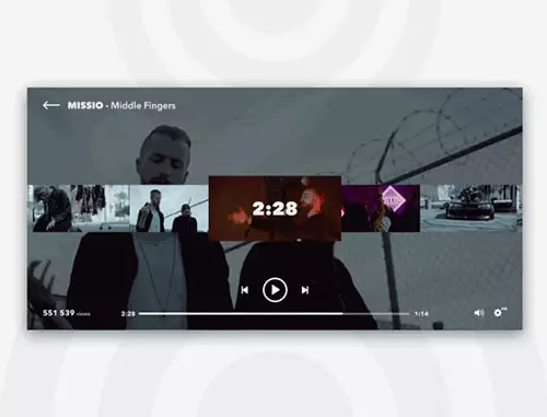
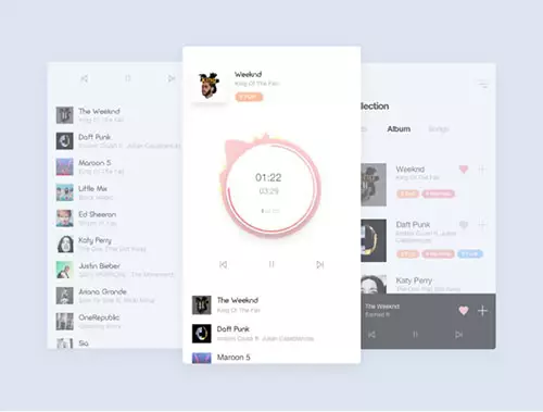
2. Live Wall Live Wall
大型银幕显示器上的音乐 APP,是不是很 cool ?
3. Album-Radial-Interaction byJohny vino™
https://dribbble.com/johnyvino
这家伙的Dribbble有很多不错的GIF,推荐关注哦。

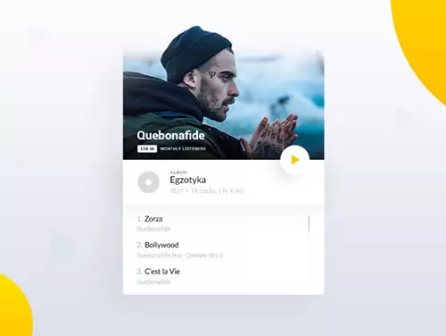
4. Music App ui kit — Material by Divan Raj
https://dribbble.com/divanraj
实用型的音乐APP布局设计。样式兼容Web、Mobile、Pad多个终端。
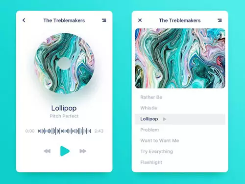
5. Music Player and Menu (dark theme) by Filip Legierski for Riotters
https://dribbble.com/kedavra
https://dribbble.com/riotters
一个暗色调的音乐APP界面,特色:菜单字体粗而大

6. Music App UI by Giga Tamarashvili
https://dribbble.com/Tamarashvili
粉色音乐 APP 设计

7. Music Player Visualizer by Mammad Emin ➔
https://dribbble.com/mammademin
这个音频动效一定很好看,就不知道程序员大哥能否实现。
8. Liquid Music Player by Apostol Voicu
https://dribbble.com/shots/3689604-Liquid-Music-Player
酷,超简约。建议大家点击作者链接查看动效,挺COOL的,这个动效设计是在音频播放时,才会动。

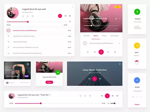
9. Musicapp4 by WantLine
https://dribbble.com/wantline
特色:色彩统一,看来是一个练习稿,又见高斯投影~
10. Musicloud — revolutionary app for music streaming by Dawid Dapszus for Netguru
https://dribbble.com/dashoo
https://dribbble.com/netguru
这个音乐的波形动效程序员应该能实现了,设计师在上面加入了一层白色渐变,这样的过渡效果不错。

11. Mini Music Player by Apostol Voicu
https://dribbble.com/cerpow
用这些大投影,确实能增加空间感,但大家作为练习稿就好了,不过如果用在网页上也可以。
12. Music Player by JPstyle for New Beee
https://dribbble.com/JPstyle
https://dribbble.com/newbeee
这种简约的界面,留白要控制得很好,不然就「简陋」了。

13. Video player concept by Dima Miro for Fireart Studio
https://dribbble.com/dmiro
https://dribbble.com/Fireart-d
视频快进时的切换效果。
14. A satellite network Music Player by cocoxin for KRC
https://dribbble.com/cocoxin
https://dribbble.com/KRClabs
又一款简约的 APP UI界面,现在流行越少分隔线表示越牛X?

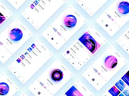
15. Music Player App [Concept] byBartosz Pobocha
https://dribbble.com/bpobocha
概念型音乐APP设计
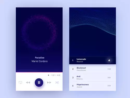
16. Music Player by Luobing
https://dribbble.com/luobing
抽象的画面很cool,特色:无任何分隔线,留白到位
17. Music player app design concept by Alex Volk for Agilie Team
https://dribbble.com/Volk88
https://dribbble.com/agilie
也是采用无分隔线设计,中间的播放界面UI比例很不错。
总结
整体来看,很多APP可能是练习稿,它的美观来自配图、色调的统一性,但在实际场景应用效果可能会大打折扣。
不管怎样,设计师就应该大胆尝试各种新鲜好玩的创意设计,并最终实现可用性与美观想结合的优秀作品!
关注『UI设计达人』
看更多精选UI设计文章
↓↓↓


 13122402111
 13122402111